

We could talk about the taste of pasta forever (and trust us, we could). But tuto isn’t just about what’s on your fork. It’s also about what you see before you even order.
Our colors, logo, and fonts didn’t happen by accident. They’re exactly like us—fresh, direct, and different from the rest.
Visuals you can taste.
When we started tuto, we knew one thing: we didn’t want to be just another boring food brand. We wanted an identity you could taste at first glance. One that doesn’t scream, but catches your eye. And when you look closer, you notice the details—just like with good food.
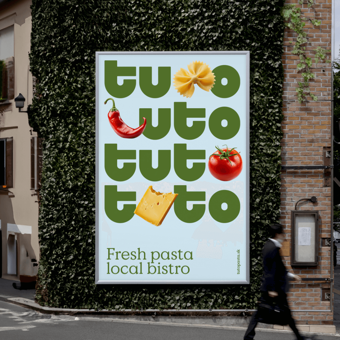

A logo made of pasta
Our logo was born from pasta shapes—yes, really. We built our visual system on pasta forms: rigatoni, casarecce, fusilli… These rounded, playful lines flow through our logo, typography, and patterns. It’s a visual code that says: Hey, someone here takes playing with pasta seriously.
“Hey, someone here takes playing with pasta seriously.”


And those colors? A Mediterranean remix
Forget the “foodie palette” of black and beige. We went for flavors—literally. Fresh green like the first leaf of arugula. Lemon energy that wakes up the palate. The earthiness and warmth of an honest kitchen. Colors that stand out but harmonize like a perfectly balanced meal. It’s no accident. It’s the Mediterranean in hexadecimal form. Colors that transport you south—yet are fresh enough to feel right even during lunch in Košice. We use a font that blends Italian tradition with a modern twist. Just like our pasta.
Fresh green like the first leaf of arugula. Lemon energy that wakes up the palate. The earthiness and warmth of an honest kitchen. Colors that stand out but harmonize like a perfectly balanced meal.

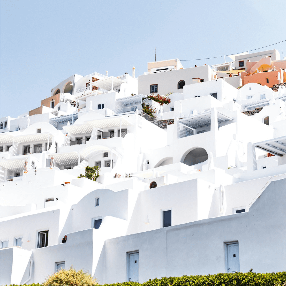
Our design isn’t decoration. It’s part of the flavor.
Our design isn’t decoration. It’s part of the flavor. How you look affects how you taste. That’s why tuto looks exactly how it’s supposed to taste—fresh, honest, artisanal, and at the same time, a little different than you’d expect.
 Bolt Food
 Wolt
Wolt Eatster